Our Objective: To Embed Google Maps on Our Website

Google Maps has surely made our lives simpler and connectivity stronger. Nowadays Businesses have a greater impact online and it is a very good practice indeed to inculcate google maps into your company website. This will not only provide the user with a better User Experience(UX) but can also help the user to understand the business’s location well. And thus it makes a good impression and gives credibility to your business.
Brief About Google Maps
Google Maps has a 150 million+ monthly average user base and there are more than 5 million websites or applications that are active users of this service. The stats clearly show the relevance of Google Maps in our lives.
Google Maps is a free service that one can go for. But Google charges some amount to embed more complex Google Maps features like street view, having multiple locations to display, etc. But most of the customer’s demands can be fulfilled using the usual plan, which this tutorial uses.
But there’s one drawback associated with them, they are not responsive, as in they do not change their proportions when viewed on different screen sizes. But this is not even a problem if you are willing to get your hands dirty and make tiny manipulations in the code. Making Google Maps responsive is an easily achievable task. There are a few different ways to make them work which we will discuss shortly.
Steps to Embed Google Maps in Your Website
Embedding Google Maps on any website involves no complex science. With a little understanding of basic programming, one can make it even responsive. Though Google Maps are interactive by default but to make them responsive, minimal effort is required. One line of code is all it takes to make your Google Maps responsive and adaptive to any screen size.
First, let’s learn how one can embed Google Maps:
- Open your browser.
- Simply make a search for https://www.google.com/maps.
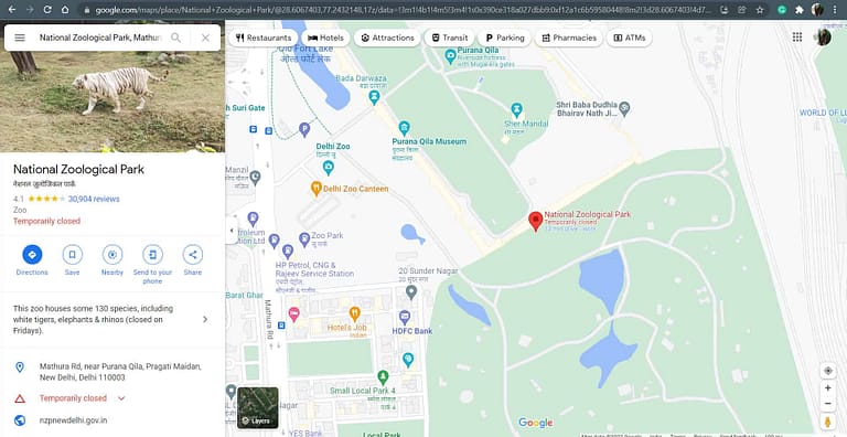
- Enter your desired location in the search bar provided on the top left side of your Google Maps Screen.

- I have searched for “National Zoological Park” and a screen like this will appear in front of you. The screen will display details about your entered location. Click on the option “share“.
Note: Icon with three horizontal lines, on the top left corner, will result in the same option “Share or Embed Map“.

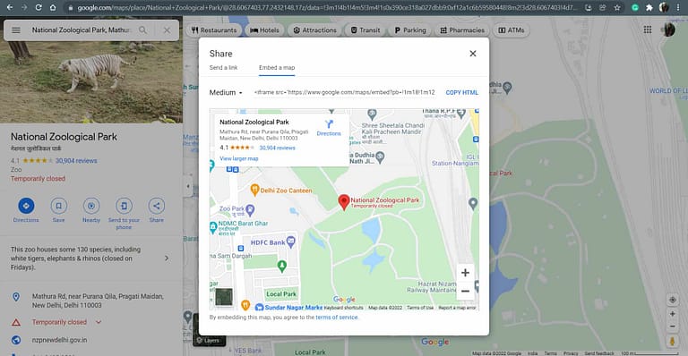
- A popup box like this will appear when we click on share/share or embed map. It will have a link to share the location that you searched for via copying the link or direct sharing on Facebook/Twitter. Now since we want to insert the map into our website, click on the “Embed a Map” tab.

- By default the size of the map is set to “medium”, but you can always choose one that fits your requirement. The drop-down will help you choose from small, medium, large and you can even customize the size by selecting the last option.

- Now click on “COPY HTML” to get the iframe tag code that will insert Google Maps in your website. The code will look like this with your input location and the frame size that you have opted for. Just copy the code and paste it exactly in your HTML file section.
<iframe src="https://www.google.com/maps/embed?......" width="600" height="450" style="border:0;" allowfullscreen="" loading="lazy"></iframe>But the drawback of this code is it has a fixed width and height. As a result, no matter what screen size you use this code on, it will always stick to these fixed dimensions. This results in a bad user experience, so it is always better to make your code responsive or adjustable with various screen sizes so that it won’t become an issue.
Making GOOGLE MAPS Responsive
Though it involves a little bit of manipulation of the code, a newbie can also do it without having to worry about it. One change of size attribute can solve this problem without even using an API.
<iframe src="https://www.google.com/maps/embed?......" width="100%" height="100%" style="border:0;" allowfullscreen="" loading="lazy"></iframe>The only attributes that we’ve played with are width and height. We have set both the attribute’s values as 100%. By doing this, we have instructed our google maps iframe to take the size of whatever screen the user is viewing it on. Giving 100% in CSS implies taking up 100% of the parent.
Suppose you’ve allocated a space of 600px for Google maps to show on your website. So by giving 100%, we have told the maps to take up the whole allocated portion on the screen. This is a very smart yet easy way to work around responsiveness in HTML and CSS.
Another way that can give you the same result is by using media queries. Media Queries are a sort of CSS styling which lets you predefine how your website will look and behave on various screen sizes. Other than this, using Google Maps API via JavaScript is also a smart way to embed responsive maps into your website or application.
That’s it for this article, please share your valuable feedback in the comments below. Make sure to share the article to make it reach the right audience.


0 Comments