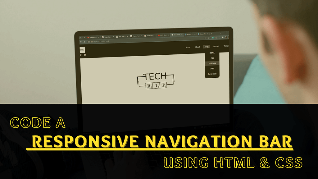
Our Objective: To code a Responsive Navigation Bar using HTML and CSS.
Talking about the current scenario, where everything is on the web and everyone wants to make their presence on the web, we have multiple e-commerce websites, technology-related websites, food blogging sites, and whatnot. So in this digital era of today, any website that you visit on the Internet has a proper structure and navigation to it, to make the User-Experience(UX) better. So the better the UX, the better the ranking.
An eye-opener study by Statista shows that out of 59.5 active Internet Users, 92.6 percent are using it via mobile devices. These statistics are enough to show how the Responsive navigation bar will play an important role in ranking among the Top Google Search results. All successful websites have one thing in common, i.e., a well-structured & Responsive Navigation Bar. It is a must-to-have factor to improve your website’s credentials overall. In this tutorial, we are going to build just that.
We are focusing to make a responsive navigation bar that contains a logo, a dropdown, and social media icons. By responsive, I mean the menu will appear the same whether you view it on a huge 4k monitor or your mobile screen. For making it responsive, we will be using something known as “Hamburger Menu”, which is nothing but the button in websites and apps that typically opens up into a side menu or navigation drawer.
For this navbar, I have drawn inspiration from Techbit’s Navigation Menu. I have made a few changes in the User-Interface(UI) and played a little around the color theme. The menubar is kept as simple and understandable as possible, just so that you can get started with the concept first. In our design, there is a horizontal navigation bar with a logo & social media icons on the left side and some navigation links on the right side. This is a very simple navigation menu and is created purely using HTML & CSS.
Table of Contents
What is Navigation Bar?
A navigation bar is a tool that is located at the top position of a webpage. It is used by website visitors to navigate through different sections of the website.
Characterisitics of a Good Responsive Navigation Bar:
A navigation bar is convenient when a webpage is long. It helps the user to easily steer to particular sections of the webpage. A navigation bar should, therefore, be simple, noticeable, and easy to use. An ideal navbar must be created with the intention of clear context, hierarchical navigation, and a call-to-action. Other than the fact, that a navbar must be responsive, it should also follow the following characteristics:
Noticeable
A navigation bar will only stand out from the rest of the website if it is located properly and is easy to grab the visitor’s attention. The navbar should be made considering the theme of the business and the rest of the website.
Simple and Easy-To-Use
It should be simple and easy to follow through. Loading the navigation bar with tons of links to the different pages of the website will only work in the negative. While coding for the navbar, special attention should be given to providing the links of the parent pages and not the particular child pages.
Project Working Directory
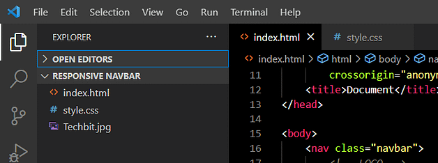
We have made one folder with the name “Responsive Navbar“. In this folder, we have the following files:
- index.html, to write the markup of our navbar
- style.css, to write the styling of the markup
- one logo file with the name “techbit.jpg”
I have opened the complete folder in my text editor, i.e., Visual Studio Code.
Pre-requisities
Before heading to our code editor, we should just consider the things that we require beforehand.
- A code editor like VS Code or Sublime text
- Knowledge of CSS
- Basic Understanding of HTML
- Font Awesome CDN (already included in the HTML code below)
- It is used to insert various icons in our code.
Source Code To Make A Responsive Navigation Bar
As this project is purely built on HTML and CSS. If you know the foundations of both languages, then it won’t be a big task to understand the code.
The HTML Code
<!DOCTYPE html>
<html lang="en">
<head>
<meta charset="UTF-8" />
<meta http-equiv="X-UA-Compatible" content="IE=edge" />
<meta name="viewport" content="width=device-width, initial-scale=1.0" />
<link rel="stylesheet" href="style.css" />
<link rel="stylesheet" href="https://cdnjs.cloudflare.com/ajax/libs/font-awesome/6.1.0/css/all.min.css"
integrity="sha512-10/jx2EXwxxWqCLX/hHth/vu2KY3jCF70dCQB8TSgNjbCVAC/8vai53GfMDrO2Emgwccf2pJqxct9ehpzG+MTw=="
crossorigin="anonymous" referrerpolicy="no-referrer" />
<title>Document</title>
</head>
<body>
<nav class="navbar">
<!-- LOGO -->
<div class="logo">
<a href="http://www.techbit.in">
<img src="Techbit.jpg" alt="techbit" height="50px" width="100px" srcset="">
</a>
<div class="socials">
<a href="https://www.facebook.com/Techbit-100123928927778"><i
class="fa-brands fa-facebook-f fb"></i></a>
<a href="https://www.instagram.com/techbit.in/">
<i class="fa-brands fa-instagram ig"></i>
</a>
<a href="https://www.linkedin.com/company/74106141">
<i class="fa-brands fa-linkedin ld"></i>
</a>
</div>
</div>
<!-- NAVIGATION MENU -->
<ul class="nav-links">
<!-- USING CHECKBOX TRICK-->
<input type="checkbox" id="checkbox_toggle" />
<label for="checkbox_toggle" class="hamburger">☰</label>
<!-- NAVIGATION MENUS -->
<div class="menu">
<li><a href="https://techbit.in/">Home</a></li>
<li><a href="https://techbit.in/aboutus/">About</a></li>
<li class="services">
<a href="/">Blog</a>
<!-- DROPDOWN MENU -->
<ul class="dropdown">
<li><a href="https://techbit.in/programming/html/">HTML</a></li>
<li><a href="https://techbit.in/programming/css/">CSS</a></li>
<li><a href="https://techbit.in/programming/python/">PYTHON</a></li>
<li><a href="https://techbit.in/programming/php/">PHP</a></li>
<li><a href="https://techbit.in/programming/javascript/">JavaScript</a></li>
</ul>
</li>
<li><a href="https://techbit.in/contact-us/">Contact</a></li>
<li><a href="https://techbit.in/write-for-us/">Write For Us</a></li>
</div>
</ul>
</nav>
<div class="homepage">
This is the Homepage!
</div>
</body>
</html>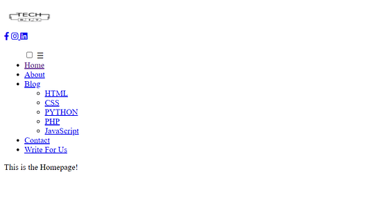
Adding CSS to the above code will give it a completely different and attractive outlook. We are using the hamburger menu style to make it mobile-ready.
The CSS Code
/* BASIC */
* {
    margin: 0;
    padding: 0;
    box-sizing: border-box;
}

a {
    text-decoration: none;
}

li {
    list-style: none;
}

/* NAVBAR STYLING STARTS */
.navbar {
    display: flex;
    align-items: center;
    justify-content: space-between;
    padding: 20px;
    background-color: rgb(0, 0, 0);
    color: rgb(255, 255, 255);
}

.nav-links a {
    color: rgb(255, 254, 254);
}

/* LOGO */
.logo img {
    padding-left: 25%;
}

/* Social Media Icons */
.fb {
    padding: 5px 0px 0px 20px;
    color: rgb(255, 255, 255);
    font-weight: bold;
}

.ld {
    color: rgb(255, 255, 255);
    padding: 5px 0px 0px 20px;
    font-weight: bold;
}

.ig {
    color: rgb(255, 255, 255);
    padding: 5px 0px 0px 20px;
    font-weight: bold;
}

.fb:hover,
.ig:hover,
.ld:hover {
    color: rgb(59, 59, 59);
}


/* NAVBAR MENU */
.menu {
    display: flex;
    gap: 1em;
    font-size: 18px;
}

.menu li:hover {
    background-color: rgb(59, 59, 59);
    font-weight: bold;
}

.menu li {
    padding: 5px 14px;
}

/* DROPDOWN MENU */
.services {
    position: relative;
}

.dropdown {
    background-color: rgb(0, 0, 0);
    padding: 1em 0;
    position: absolute;
    display: none;
    border-radius: 18px;
    top: 35px;
}

.dropdown li+li {
    margin-top: 8px;
}

.dropdown li {
    padding: 0.5em 1em;
    width: 8em;
    text-align: center;
}

.dropdown li:hover {
    background-color: rgb(59, 59, 59);
}

.services:hover .dropdown {
    display: block;
}

/*RESPONSIVE NAVBAR MENU STARTS*/
/* CHECKBOX TRICK */
input[type=checkbox] {
    display: none;
}

/*HAMBURGER MENU*/
.hamburger {
    display: none;
    font-size: 24px;
    user-select: none;
}

/* APPLYING MEDIA QUERIES */
@media (max-width: 768px) {
    .menu {
        display: none;
        position: absolute;
        background-color: rgb(0, 0, 0);
        right: 0;
        left: 0;
        text-align: center;
        padding: 16px 0;
    }

    .menu li:hover {
        display: inline-block;
        background-color: rgb(59, 59, 59);
        transition: 0.3s ease;
    }

    .menu li+li {
        margin-top: 12px;
    }

    input[type=checkbox]:checked~.menu {
        display: block;
    }

    .hamburger {
        display: block;
    }

    .dropdown {
        left: 50%;
        top: 30px;
        transform: translateX(35%);
    }

    .dropdown li:hover {
        background-color: rgb(59, 59, 59);
    }
}

/* TEXT IN CENTER */
.homepage {
    font-size: 50px;
    padding: 20% 0% 10% 35%;
}
@media (max-width: 768px){
    .homepage{
        font-size: 30px;
        padding: 40% 0% 10% 22%;
    }
}
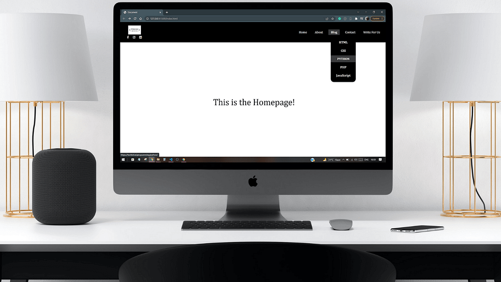
The Outcome
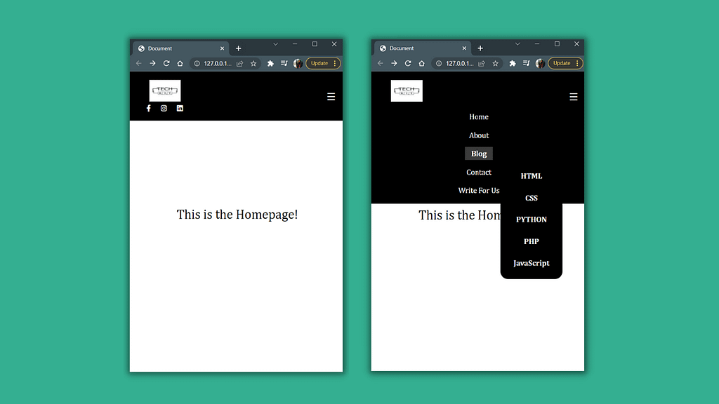
So here is the final result of what we have coded till now. This is a basic navbar with all the necessary pages of the website. I have mentioned Techbit’s links in the menu bar, you are free to use these for practice purposes or create new links for your own project.
Desktop:
Mobile:
So that’s a wrap for this tutorial. I really hope it helped you in a better understanding of mobile-first designs and the benefits that come along with them. Not having good website navigation and structure will directly affect the visitor’s footfall, conversion rates, and clearly, the bounce rate will also be affected. A correctly designed navigation bar with the right context and the links will benefit you a lot as the visitors will have a clear pathway of navigating between various important pages of your website.
A navigation bar is a vital tool for the user navigation experience. It should be built with the aim to land visitors on the most popular pages of your site. So keep on trying and experimenting with what fits well for you. This article will surely guide you in achieving an ideal navbar for your website.
If you have enjoyed reading this article, then don’t miss out on these:
- The Most Asked HTML Interview Questions Of All Time
- 8 Best Python Books for Beginners and Advanced Programmers
- Easily Code A Weather App In Python Using Tkinter
- Easy Script to Make Your Own Youtube Video Downloader with Python
- Python 01: How To Easily Convert Text To Handwritten Notes using Pywhatkit?
Make sure to comment down below if you have any doubt regarding anything stated above, or if you want to contribute to the article.
Let’s get connected on our Social Media Handles:

0 Comments